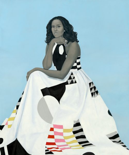
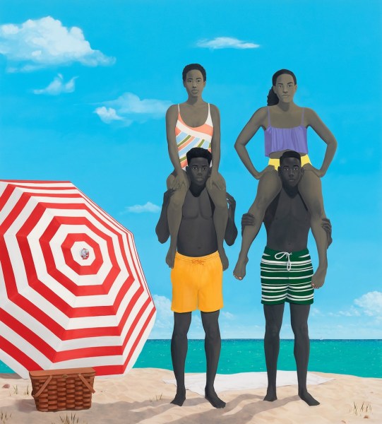
American painter Amy Sherald (born 1973) has been a prominent name in the art world news recently—thanks especially to her portrait First Lady Michelle Obama (2018) that hangs in the National Portrait Gallery, Washington, DC. The commission has definitely been a significant event in her artistic career—as has been the 2016 Outwin Boochever Prize awarded from the same museum for the painting Miss Everything (Unsuppressed Deliverance). But a good share of Sherald’s fame can also be attributed to a very distinctive feature about her practice.
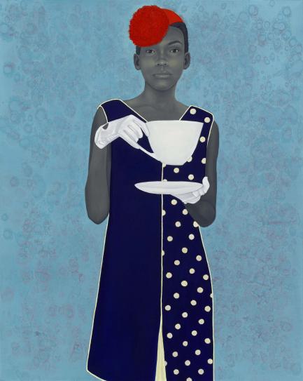
Her African-American subjects are portrayed and celebrated in their individuality—there are no direct references to historical, social or political issues. The viewer is invited to consider the inner lives of the characters without the lens of the oppressor/victim narrative that dominates the media. This, though powerful, isn’t all that uncommon. What is more striking about Sherald’s art is the fact that her characters have skin painted in grayscale rather than dark flesh tones.
Hailing from the state of Georgia and now based in Baltimore, Sherald gives good reasons behind this “signature” of hers. Having grown up in the segregated society of the Deep South shortly after the Civil Rights Movement, she has always been concerned with matters of racial identity and its representation, or lack thereof. She adopted her unique style to challenge the stereotypical depictions of African-Americans.
She explains: “A Black person on a canvas is automatically read as radical. My figures needed to be pushed into the world in a universal way, where they could become a part of the mainstream art historical narrative. I knew I didn’t want it to be about identity alone.” That is, she wants her characters to be seen as persons rather than members of a particular race.
The National Portrait Gallery adds on Sherald’s practice: “This grayscale technique, also called grisaille, is connected to the artist’s early personal experiences. Sherald, who was born in Columbus, Georgia, remembers looking at family photo albums as a child and getting to know her grandmother Jewel through a black-and-white photograph. She was captivated by her grandmother’s beauty, self-possession, and confident, direct gaze in the photograph.
“When Sherald looked for painted portraits of people who looked like her in art history books in local libraries, she realized that her family’s story was absent in the history of painted portraiture. She was also discouraged when she did not find people who looked like her in the public spaces of museums. Sherald’s larger project of painting portraits of African Americans seeks to make up for this absence by addressing the history of representation.”
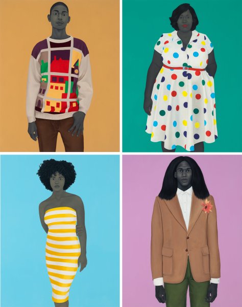
As it turns out, the grayscale has its philosophical logic—and that is valuable. It is also very useful from a marketing perspective. It is a quality that instantly sets Sherald’s oeuvre apart in a crowded visual arts economy. It gets people thinking and guessing. When art lovers discover that the artist has implemented this feature in painting after painting—their curiosity is piqued. Grayscale skin in an otherwise coloured artwork here is incongruous. People are not used to it. It makes them wonder—Why so? What is she up to? People are intrigued by the statement Sherald wants to make through her images. They find her decision to go against convention bold and impressive.
Sherald is a great case study for artists who are serious about building a large audience. Attention is a scarce resource today. If you want people to interact with your content, just being technically excellent in your form of art may not be enough. There should be something different about you—that nobody else is doing, that actually makes you hard to ignore as people scroll down their social media feeds. Perhaps a juxtaposition of elements or a manner of execution that is unexpected.
American author Seth Godin uses an interesting metaphor for such a phenomenon in his writings on advertising, marketing and product development: “purple cow” . A strange aspect that will make your brand visible and keep you relevant. “Purple” and “cow” is not a connection that comes naturally to our minds, and so seems particularly distinctive. Cows are never purple, just how the skin of African-Americans isn’t gray.
Learning from Amy Sherald, artists can develop a unique visual language wherein there are features big or small that disrupt our sense of familiarity—maybe oversized human eyes, maybe green domestic atmosphere. It need not be outright shocking. It could just be unusual, even a bit weird. Slightly out-of-place and repetitive so that it can keep people engaged.
Written by Tulika Bahadur.