Black paint gave me a hard time. I struggled to use it in a way that made sense. Found its lack of nuance disturbing. I am not referring to dark colours or colours in the shade, but to black paint. Like being trapped in a cave where you cannot see your hand in front of your face. In writing this blog piece I discovered that black as a colour is moot.
For example, many people do not regard black as a colour. They adopt a scientific point of view that colour is created by a specific wavelength reflected from an object. The argument is that black is not supposed to reflect colour because it absorbs colour. This argument regards black as the absence of light. The same argument also denies that white is a colour. White is a mixture of all colours. The argument concludes that you cannot have a pale black or a dark white. Yet in spite of the logic of the argument, most artists see black and white as colours. They undeniably exist. And there is a range of black colours a painter can use. Whenever I used black paint in the past to darken a colour or to introduce shade, black simply took over, destroyed what I was doing. It became a relentless Pac-Man, devoured colour and made everything sombre. Widows grieved in black dresses. Hearses were black. Black was death. To overcome the problem, I used Paynes Grey mixed with Mineral blue. My black paint tubes dried out.
I first became aware that black was nuanced as opposed to “black is black” in a Melbourne Art Class session presented by David Palliser. He noticed that I was using Mars black paint and immediately suggested a different dark colour. I was perplexed and later asked David for a why. In turn he said “Black is not to be scared of. Matisse used a lot of it. It gives strength and definition- life enhancing forces. It’s the obvious colour for drawing ……. There are many blacks- mars and cold black. Use them side by side and feel the vibration- the same as different types of any hue. Ultramarine loves black- Cobalt blue and black are almost too powerful, Prussian blue and black scary. It’s great to use with very pale pinks and very pale green tinged yellow. I must now unstack the dishwasher”.
Conversations with David are serendipity. Everything he says moves beyond the canvass you are looking at and sometimes it pauses at a dishwasher. I immediately looked at Matisse and spent some time with his pieces The Music, Laurette in a Green Robe, Black Background and Laurette in Green in a Pink Chair. The Laurette paintings affirmed David’s comments and expanded my palette.
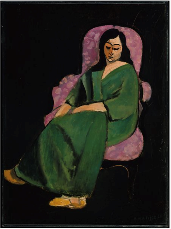
Henri Matisse, Laurette in a Green Robe, Black Background
I can compare using black paint to reading notes and chords on sheet music. I can play the notes and chords, but it does not necessarily make a song. It is the same with colour. The painter has to make the colours tell a story, sing, dance and feel. Matisse uses black paint to create magnificent paintings. He uses it primarily to create contrasts. At times to introduce a mood. In the Laurette paintings he used different blacks. Compare Laurette’s hair with the black chair frame and the black background. Matisse teaches us that the relationship between black and other colours are divine. It creates possibilities. Colour is the key to understand Matisse. “I don’t paint things” he said. “I only paint the difference between things. Colour helps to express light, not the physical phenomenon, but the only light that really exists, that in the artist’s brain”. Just like that he un-moots black, makes you climb into your head.
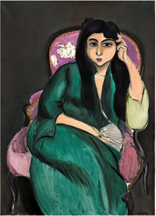
Henri Matisse, Laurette in Green in a Pink Chair, 1917
Black paint has never been timid or languishing in some container waiting for a brush. It is bold and challenges perception. I believe the prejudice against black paint arose because the Impressionists became dogmatic. Didactic, scientific and bureaucratic whilst ignoring the limitations of science. The Impressionists used very little black paint. Monet famously said he did not allow himself to use black. It perplexed the great American portraitist, John Singer Sargent, who told Monet that he could not paint without black paint. The Impressionists used a variety of colours to paint an object. They ignored mono chromatism. An example of Impressionists not using black, is Monet’s Water lily leaves. They are painted in greens, blues and mauves. Black in turn is extreme monochromatism.
Impressionists said black seldom exists in nature. They suggested that black ignores changes in hue. It creates an absolute contrast that can be “poor” because it ignores changes in hue within black. Monet’s paintings for example create energy by changes in hue and using many colours. Impressionists are painting light and it is not surprising that they ignore black paint. Contrast the Impressionists with JWM Turner who said “If I could find anything blacker than black, I’d use it”. In art, rules limit imagination. Einstein whimsically said that art was intelligence at play. Sometimes I think one must become familiar with rules in order to break them. Both Monet and Matisse were giants, explorers, pathfinders and I cannot imagine art without them. One ignored black to make a point. The other used black to make another point.
In the Guardian of 28 August 2013, Jonathan Jones discusses Kasmir Malevich’s Black Square. He writes, If black is the colour of death, Malevich painted modern art’s most morbid vision. His Black Square is, as its title may suggest, a solid square of blackness painted within a white border on a square canvas. Malevich painted the original Black Square in 1915 and it still survives, though cracked and decayed and with white peeping through the splintering darkness. With this piece, Malevich intended to paint “the face of the new art”. It is an extreme and radical statement, maybe deliberately painted to make us think. It was painted at a time of great social upheaval in Russia. A revolution was brewing that was going to change everything in Russian society. In that sense the black square is a prophecy of kinds. Forget everything it says, go back to the beginning and start again. To quote Jones –The black square looks back bleakly at life. It seems to suck out energy and create an uncanny stillness. Malevich painted an icon of emptiness that can destroy your faith in history, progress, art. It was painted when Russia was doing badly in the First World War. Roaring inflation and food scarcity. The population was fractious. Almost waiting for a saviour. And in 1917 Lenin arrived on a train.
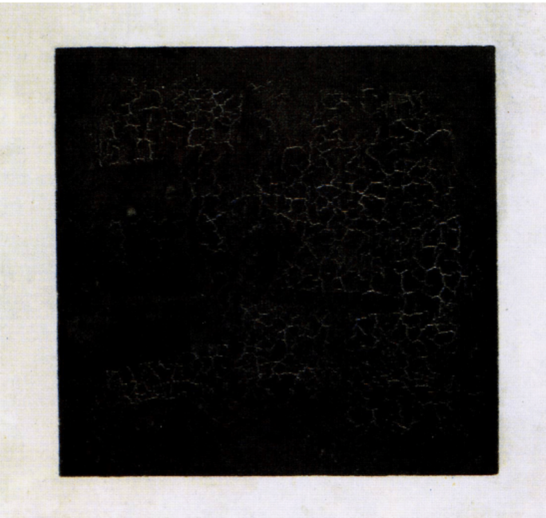
Kazimir Malevich, Black square , 1915, Oil on Canvas, State Tretyakov Gallery
Pierre Soulages
Many regards Pierre Soulages as perhaps the greatest living French painter today. Soulages is often described as the painter of black. He sees black as a colour and as a non-colour. He used thick black paint strokes against lighter colours. His black strokes are labelled “outrenoir” or beyond black. See Soulages’s Lithographie n° 36, 1974 below.
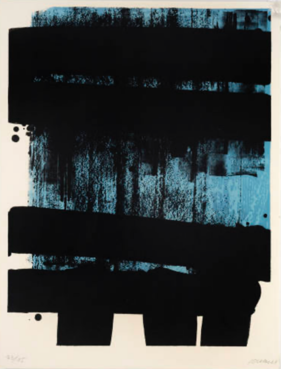
Pierre Soulages, Lithographie n° 36, 1974
Soulages uses light as a work material. Lines of the black surface of his paintings enable him to use a different colour that reflects light, allowing the black to come out of darkness and into brightness, thus becoming a luminous colour.
Kara Walker
Kara Walker is an American artist who used black cut silhouettes against a white background. Her paintings emphasise the cruelty of racism, a point her black shapes do very effectively. Her work has a disturbing energy reminding us of how cruel people can be.
Kara Walker, A Work on Progress, 1998, Cut paper on wall. 69 x 80 in. (175.3 x 203.2 cm).
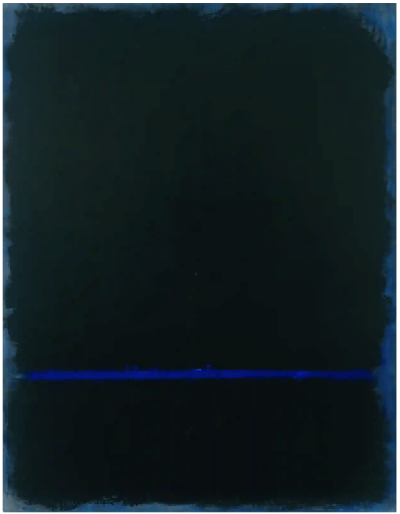
Mark Rothko
Mark Rothko is another artist who did not hesitate to use black paint. In his final years he moved away from yellows and other so-called cheerful colours. Blacks, browns, maroons all regularly featured in his work. In Untitled 1968, Rothko used bits of blue to create a gentle and softer black. I refer back to my conversation with David before the dishwasher interrupted. Black is not all doom and gloom. It is alive.
I believe black works best when it can be used with other colours. It is a relationship builder or matchmaker if you like.
Differences Between Black Paints
Primarily there are about three black paints on the market being Mars Black, Ivory Black and Carbon (Lamp) Black. These colours differ further depending on what brand is selected. It is difficult to determine the warmest and coolest black. An internet search presents opinions that run amuck. I believe the differences are too minute to provide a definitive answer. I simply test the paint by painting red and blue next to it. If it goes well with red, I regard it as warm and vice versa with blue paint. In the above Rothko painting the black looks warm next to the blue.
Mars Black
Mars Black is different to other black pigments because it is not carbon-based. It is derived from synthetic iron oxides as an alternative to natural earth pigments. It is also the most opaque of the black pigments. It is not as black as other black paints but paradoxically the “strongest” black that can easily overwhelm other paints. Very good for covering large areas. Anselm Kiefer for example uses Mars Black when he only wants black in a painting. Mars Black is also a matte colour. If you wish to mix it with other colours, you should be careful and only use small quantities. I find it best to experiment with how much I add. Much easier to use Ivory Black instead.
Ivory Black
I believe that Ivory Black is the friendliest of all the black paints. It is the most malleable black. It is made from charred animal bones and may elicit objections from committed Vegans. It is “blacker” than Mars Black and it is semi-opaque. It is the easiest black paint to mix with other paints and is less likely to take over and become absolute.
Carbon or Lamp Black
Carbon Black is made today by burning coal or natural gas, but is traditionally derived from carbonising plant matter, like in the production of charcoal. It is very opaque and has a high tinting strength Paints made with thanks to the small, dense pigment particles. It can range from neutral to cool in temperature. I do not like it because it is pure carbon made from burning fossil fuels.
Next time you hear the Rolling Stones singing Paint It Black, stop and think which black. In the interim experiment with black. It is like opening a door.
Written by Luisa Blignaut.