There is an old Indian parable revolving around six blind men and an elephant (part of many religious traditions) that powerfully illustrates the perennial tension between subjectivity and objectivity. The narrative is simple—the blind men (or “men in the dark”) try to touch an elephant to learn what it is like. Each touches only a part (side or tusk or ear or something else) and hastily concludes that it must be the elephant’s real and only form. They quarrel long and loud upon discovering the incompatibility of their accounts. The story has been used to encourage intellectual humility and respect for the views of one’s opponents. It is also a reflection on the tricky nature of truth and highlights the need for dialogue in human society.
The tale holds a special place in Jainism, where is it used to explain the fundamental doctrine of Anekāntavāda (literally “the school of many-sidedness”). According to Anekāntavāda, reality is perceived differently by different individuals leading to a multiplicity of vantage points. No single human being can claim to have a monopoly on absolute truth but the sum of various vantage points may give us access to greater fact. Anekāntavāda is closely related to two other doctrines: syādvāda (the theory of conditioned viewpoints) and nayavāda (the theory of partial viewpoints). The tale was popularised in the English-speaking world through a version written by the American poet John Godrey Saxe (1816-1887). It begins this way: It was six men of Indostan, / To learning much inclined, / Who went to see the Elephant / (Though all of them were blind), / That each by observation / Might satisfy his mind.

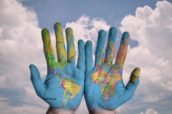
When I think of this fable, I am especially reminded of cartography. Map-making is one of the supreme pursuits of humankind whereby it has made its ingenuity and creativity manifest. People have been capturing, containing, measuring and making sense of space for centuries and there has been no map, from any place or any period, that can be considered fully “objective”. Our positioning of the continents, our sense of north-south-east-west, of centres and edges have been traditionally predicated upon our political and religious systems.
Consider two examples:
First, the Hereford Mappa Mundi (https://www.themappamundi.co.uk/) dating back to 1300 displayed today at Hereford cathedral in the county of Herefordshire in western England. For Christian Europe of the 13th and 14th centuries, the spiritual centre of the world was the city of Jerusalem–it was also the geographical centre of their maps. Second, the 19th-century maps coming from Britain (built upon the Mercator Projection first introduced by the Flemish geographer and cartographer Gerardus Mercator in 1569) that were structured to emphasise the scale of the empire with Britain painted red and placed prominently in the middle, and embellishments all around that depicted the culture of the colonies.


The map that we consult today is definitely stripped of adornments but it still cannot be called merely or thoroughly “scientific”. It remains coloured by early modern European imperialist ambitions. The phenomenon of the “northern hemisphere” (with Europe and the United States) at the top and places like Africa and South America at the bottom are, at their core, just arbitrary conventions. If there is no reason why the map shouldn’t look this way, there is no reason why the map should look this way either.
The big lesson that we learn from the parable of the blind men and the elephant is that all viewpoints are conditioned. So no matter what cartographic framework we adopt of our spherical earth, we shall continue to aid particular political perceptions of the world (that obviously have huge psychological consequences). We cannot aim to reach a position of absolute impartiality in this matter.
A way in which we may hope to attain a measure of fairness, if not complete neutrality, then, is by exposing ourselves to various kinds of maps from time to time, historical and contemporary. Oxford historian Peter Frankopan, in his acclaimed book The Silk Roads: A New History of the World (2015), writes about the experience of growing up with a (usual, normal) world map pinned on the wall by his bed, and how his subsequent encounters with the Hereford Mappa Mundi and an important medieval Turkish map (that had at its heart a city called Balasaghun) made him aware that the world could be seen and interpreted through dramatically different lenses. Frankopan’s engagement with these maps enabled him to get past the rigid and limited Eurocentric view of history that he had been hearing in the classroom.
Today there are many (less popular) cartographic proposals that challenge the Mercator Projection and encourage us to look at the earth in non-conventional ways: by placing the south up, by placing the Pacific at the centre, etc.


Brooklyn-based Northern Irish artist Oliver Jeffers (https://www.instagram.com/oliverjeffers/)—for his current exhibition “Observations on Modern Life”—at Lazinc gallery (https://www.instagram.com/lazinc/) in London has come up with maps that question our orientations—he turns the north down, dissolves nation states as we know them, shifts the borders that we are used to, and makes everything a matter of “land” and “sea” and not this country or that country.
In our hyperconnected world, for the sake of practicality, it is not possible to adhere to multiple systems of cartography but art is one arena wherein we may certainly explore and communicate these alternative proposals, like Jeffers, in new and exciting ways, expanding our horizons thereby.
Written by Tulika Bahadur.